Data-310-Public-Raposo
Data 310 project summaries
7.22.20 Class Exercise:
A. Boosted tree
- What is a one-hot-encoded column and why might it be needed when transforming a feature? Are the source values continuous or discrete?
One-hot_encoding is a function used for feature engineering. It transforms columns into categorical data into digits (using 2 discrete digits such as 0 and 1, where their order is not significant) to represent the absence or presence of a data points belonging to a given category. For example, in the Titanic dataset, sex could be split into 2 classifications- male = 0 and female = 1. So a female passenger would have a 0 in the column labeled male and 1 in the column labeled female. Generally, the source values are discrete. - What is a dense feature? For example, if you execute example = dict(dftrain) and then tf.keras.layers.DenseFeatures(your_features)(your_object).numpy(), how has the content of your data frame been transformed? Why might this be useful?
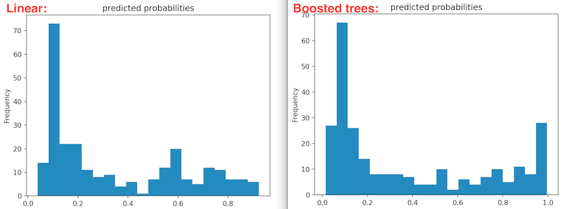
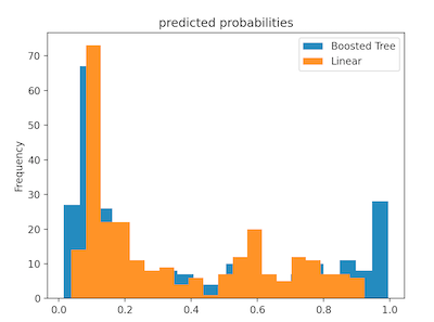
Dense features both specify the presence of data and the absence of data (often with a 0). Hot-encoded columns are an example on dense features because they contain a value in every entry (indicating true or false in refference to the category of a data point). Dense features might be useful when training or testing data becuase unknown/missing values may cause errors in running the model (can’t interpret a string that says “unknown”, “NaN”, etc). - The plot below shows the probability distribution of a linear classifier model and a boosted tree model on the data. The probabilities of the linear model are widely spread with a right skewed. It doesn’t appear that the model is very certain if anyone will survive or not. Contrarily, the probabilities for the boosted tree model are a binomial ditribution, meaning that the majority of the probabilities fall on either extreme. This means that the model is more certain of the passengers fate than the linear model.
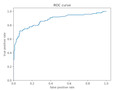
Below is the rate of change (ROC) plot for boosted tree model. The slope along the vertical axis is quite steep initially, which means that the rate of true positives is increasing faster than false positives. Although this is a good sign in traiing a model, the curve begins to level out at around 80% accuracy. This means that the model becomes significantly more inacurate as it continues to train (overfitting). The area under this curve is also indicative of accuracy because the more quickly accuracy increases and levels off (and the closer it gets to 1 in the y/vertical direction), the more accurate the model. In these instances, there is a greater area under the ROC curve.
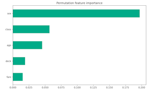
B. Boosted tree continued - From the below horizontal bar plot and violin plot, it is clear that sex and age were the two features that contributed the most to the predicted probabilities. I would say that, based on the plot, it was a bad day to be 31 year old male in second class… From these charts we can also gather that paying more for a ticket seems to increase chances of survival.
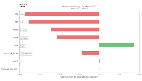
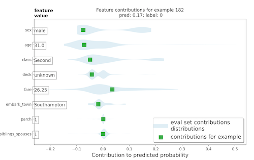
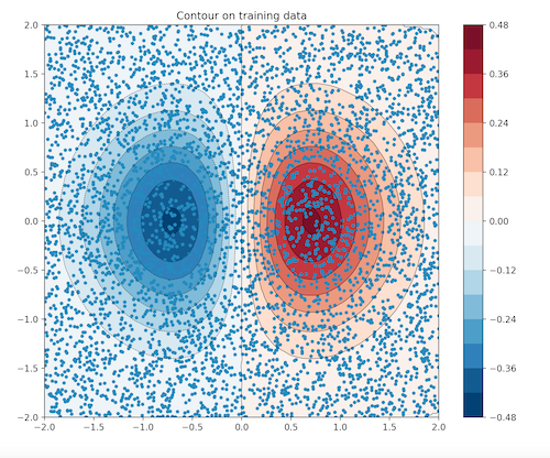
- Below are a horizontal bar plot and gradient boosting plot. As you can see, sex (by far) had the largest impact on survival. As supported by the above horizontal bar plot, some feature categories positivly contributed to survivial rate while others detrated form it. This concept can be visualized in the gradient boosting plot below. This of this graph similarly to a topographical map- red indicates positive or upward 3D positioning and blue indicates negative or downward 3D positioning. If a passengers categorization for sex was male, their age was 31, and they were traveling in the 2nd class, their datapoint would be situated in the dark blue zone- they have a low likelyhood of survival.
